I had a talk with my several fellow designers and artists about building their own website and an interesting thing came up, they don’t know where to start. Obviously, they want to show the best of their works, have the website clean and uncluttered, user friendly and of course unique and speaking about the author. No need to say that simplicity sells, so in our todays post we decided to study several most popular and successful approaches towards simplicity in design of a website home page for designers, illustrators, photographers, painters and other people of art.
Tip 1. Splash page can save it all.
If you feel that your home page turned out to be not that simple and balanced as you wish, make a splash page, a very simple one. Find some of your creatives that people like most and place it somewhere on page (the less expected the location is the better). The feeling of simplicity from the splash page will stay with the website visitor once he launches on your home page. Same thing about your artwork, even if the website itself seems somewhat disappointing, the great work on the home page can save it all.
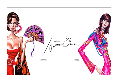
Arturo Elena. Graphic design and illustration.
http://www.arturoelena.com
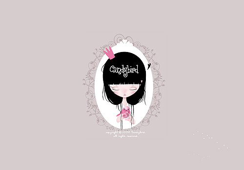
Candybird. Graphic design and illustration.
http://candybird.free.fr
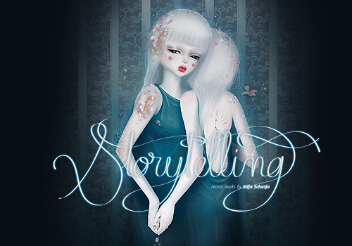
Marie Blanco Hendrickx. Illustration, drawing.
http://www.mijnschatje.fr
Tip 2. Create the home page around some work from your portfolio.
Make an accent on the painting/photo/illustration that should take approximately 75-80% of the home page. This is the most popular and successful approach that allows multiple variations.
B9. Graphic design and illustration.
http://www.b-9.it

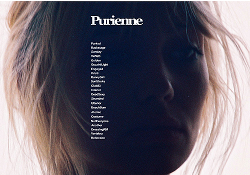
Henrik Purienne. Photography
http://www.purienne.com
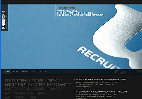
Rareform Branding. Branding and design communications.
http://rareformbranding.com
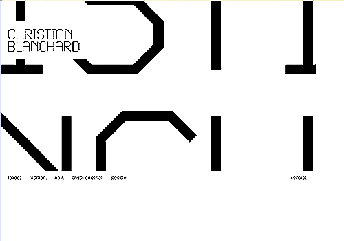
Christian Blanchard. Photography.
http://www.christianblanchard.com
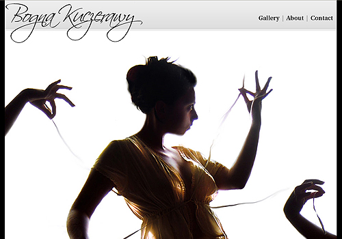
Bogna Kuczerawy. Photography.
http://exquizzite.com
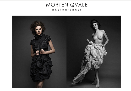
Morten Qvale. Photography.
http://www.mortenqvale.no
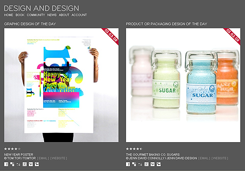
Design and Design. Community of graphic and package designers.
http://www.designanddesign.com
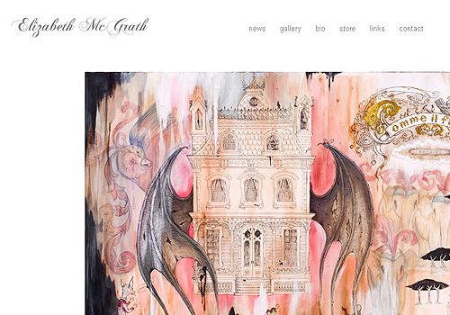
Elizabeth McGrath. Graphical and industrial design.
http://www.elizabethmcgrath.com
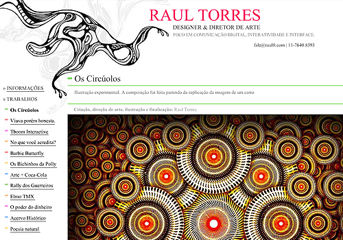
Raul Torres. Design and illustration.
http://raulft.com
Tip 3. Make home page a part of your art collection.
This tip works for illustrators, painters, graphical designers. You can enhance the menu, the corners, the background with the elements of your works making the home page itself a piece of art.
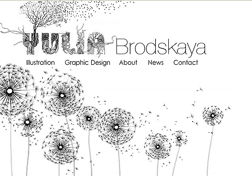
Yulia Brodskaya. Painting, photography, graphic design.
http://www.artyulia.com
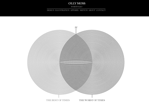
Olly Moss. Design, illustration, drawing.
http://www.ollymoss.com
Tip 4. Make it just text.
Though this may seem strange, that’s a good idea even for portfolio website. For some reason solely the text makes the portfolio even more attractive since you don’t know what to expect.
Markus Hofer. Industrial design.
http://www.markushofer.at

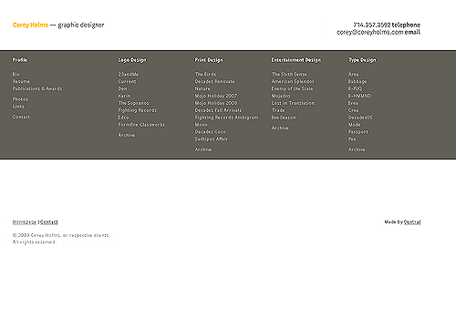
Corey Holms. Graphic design.
http://www.coreyholms.com
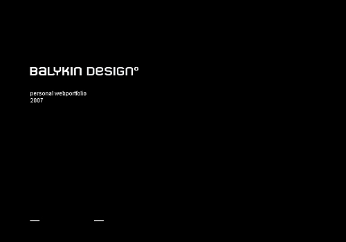
Balykin Design. Graphic design.
http://www.balykindesign.com
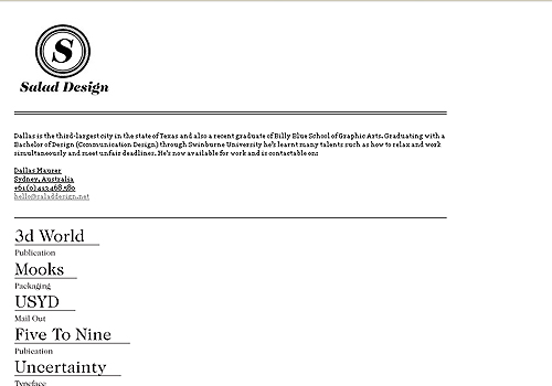
Salad design. Graphic design.
http://www.saladdesign.net
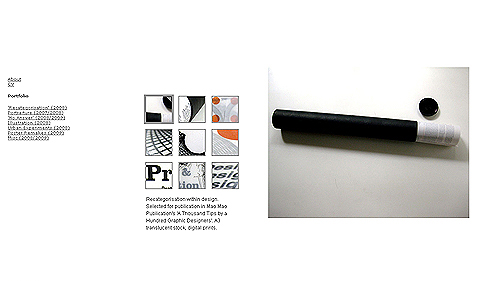
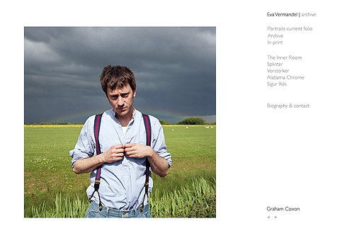
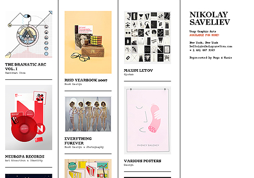
Tip 5. Divide the page into separate blocks.
It’s like in your own appartment. Several well chosen things in different corners of the room form the style. If you put all of them into one place that’ll definitely be a mess.
Aldous Massie. Graphical design, illustration, painting.
http://aldousmassie.com
Eva Vermandel. Photography.
http://www.evavermandel.com
Ben Tour. Illustration.
http://www.thetourshow.com
Nikolay Saveliev. Graphic Design.
http://www.nikolaysaveliev.com
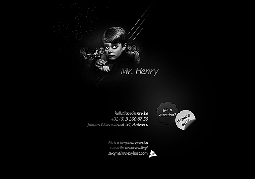
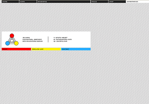
Tip 6. Make something.
Build the home page in your own style using no more than 5 elements. It’s the first 5 seconds that make the impression, so try to keep your visitor interested.
Mr. Henry. Graphic design firm.
http://www.mrhenry.be
Jo Cope. Conceptual garment and accessory design
http://www.jocope.com
4 comments
I think simplicity can be far more effective than a busy, over packed web design. the images you have shown are so beautiful that strike more to consumer than many others that are packed with content.
The tips you give, really make sense with the examples you give of simplistic designs.
Designs should be attention taking and it need not be stylish. Simple designs normally grab the needed attention, it leave the stylish ones far more behind. The designs put down by you are simply awesome and simply amazing to see,you have worked very well on them i am sure many will like 2 see it. Even the tips are good for those who are new to designing field and are not having much experience.
Great! post! ;-) Regards, V.
the easiest way would be to have an on the net portfolio, get in touch with informoation, and hand out venture cards that redirect potential clients to your portfolio.