 Editor's Pick
 17 min read
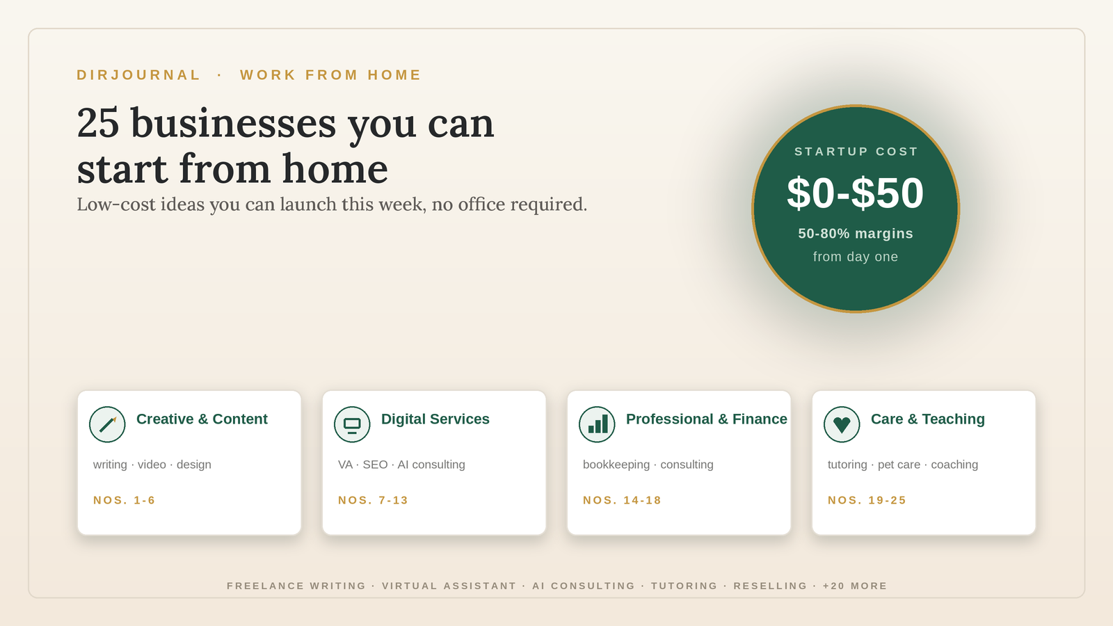
25 Businesses You Can Start From Home (With Little to No Money)
JM
Jennifer Mattern· Jul 1, 2026
Read article Verified Insights · Editorial Board
88 articles · continuously updated since 2007
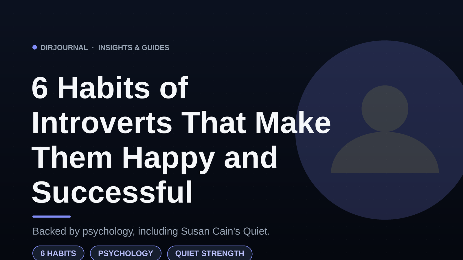
Introverts have a competitive advantage in six distinct ways — active listening, deep focus, intentional socialising, self-care, independent thinking, and embracing solitude. Here's how these habits drive success.

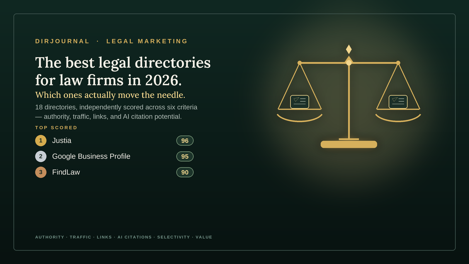
An independently scored guide to the 18 best legal directories — with domain authority, traffic figures, link type, AI citation value, and full pros/cons for every entry.
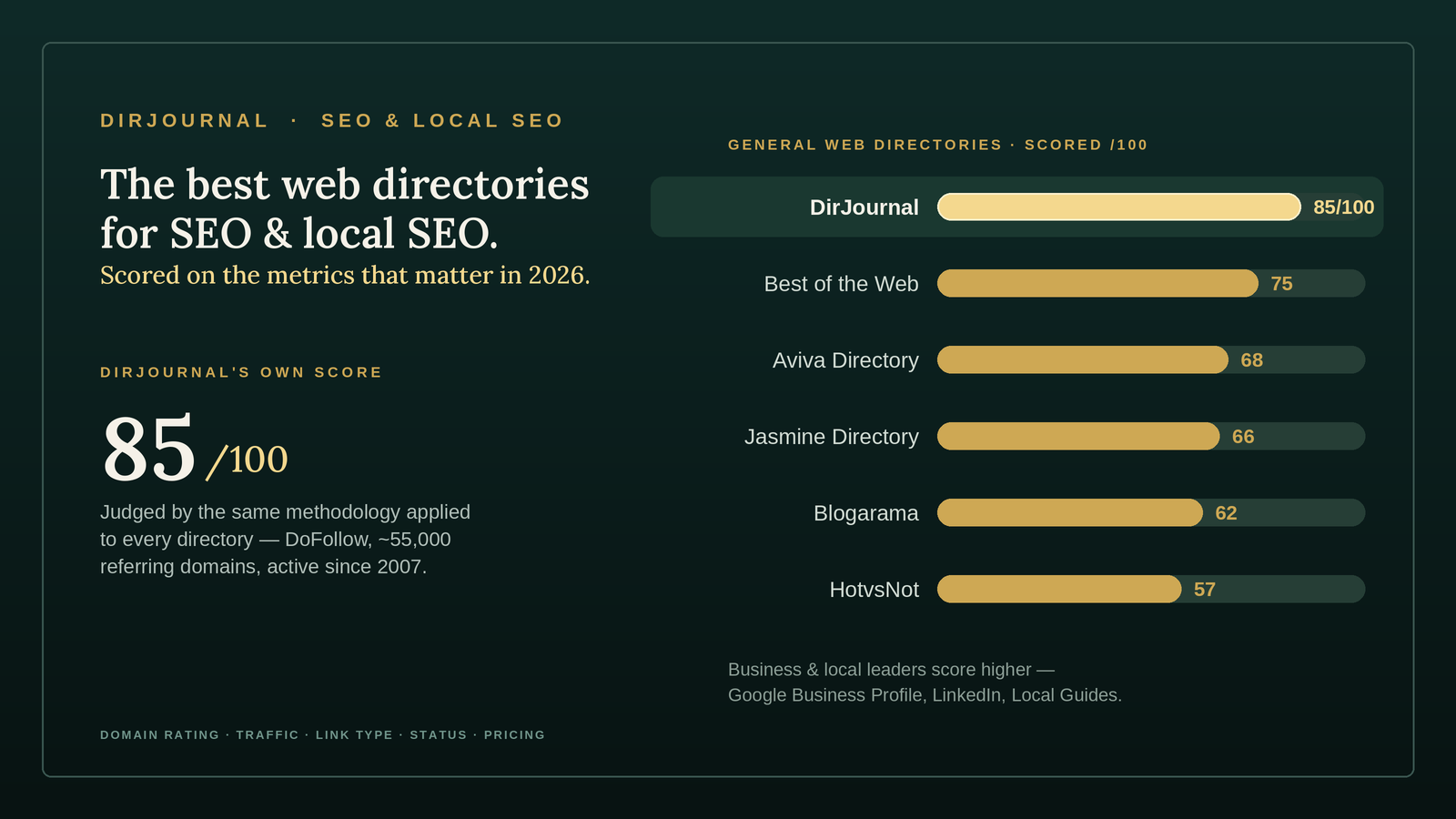
The best directories for SEO are Best of the Web, Jasmine Directory, Aviva, and Blogarama among general directories, plus Google Business Profile and LinkedIn among business directories. The link farm era is over, so a listing only helps when a human reviews it and the directory carries real authority. A listing on a spam directory hurts you.
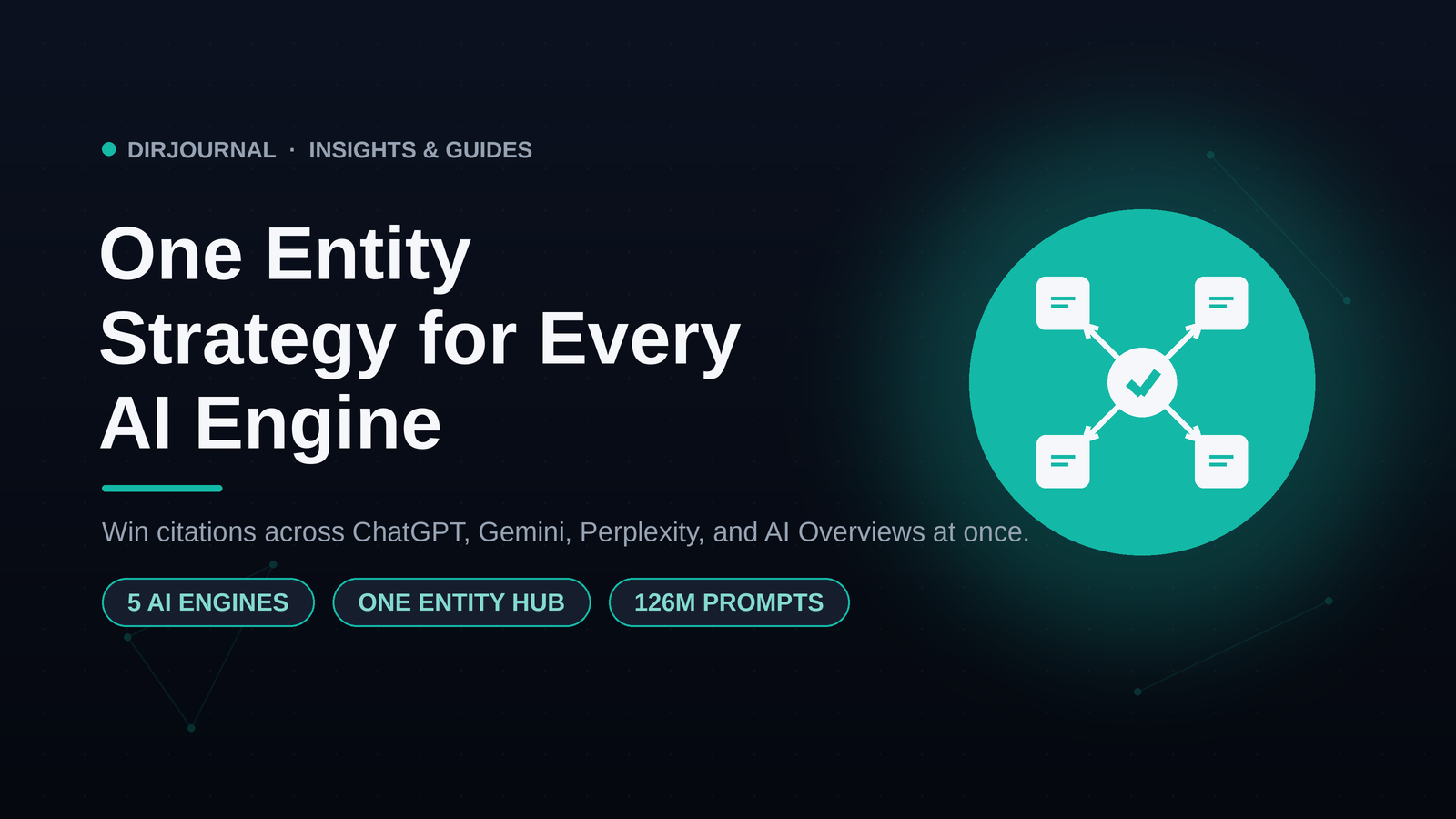
Optimizing for individual AI engines is a trap because their rules change weekly. Here is the Platform Agnostic Entity Strategy that wins citations from ChatGPT, Gemini, Perplexity, and Google AI Overviews at the same time.
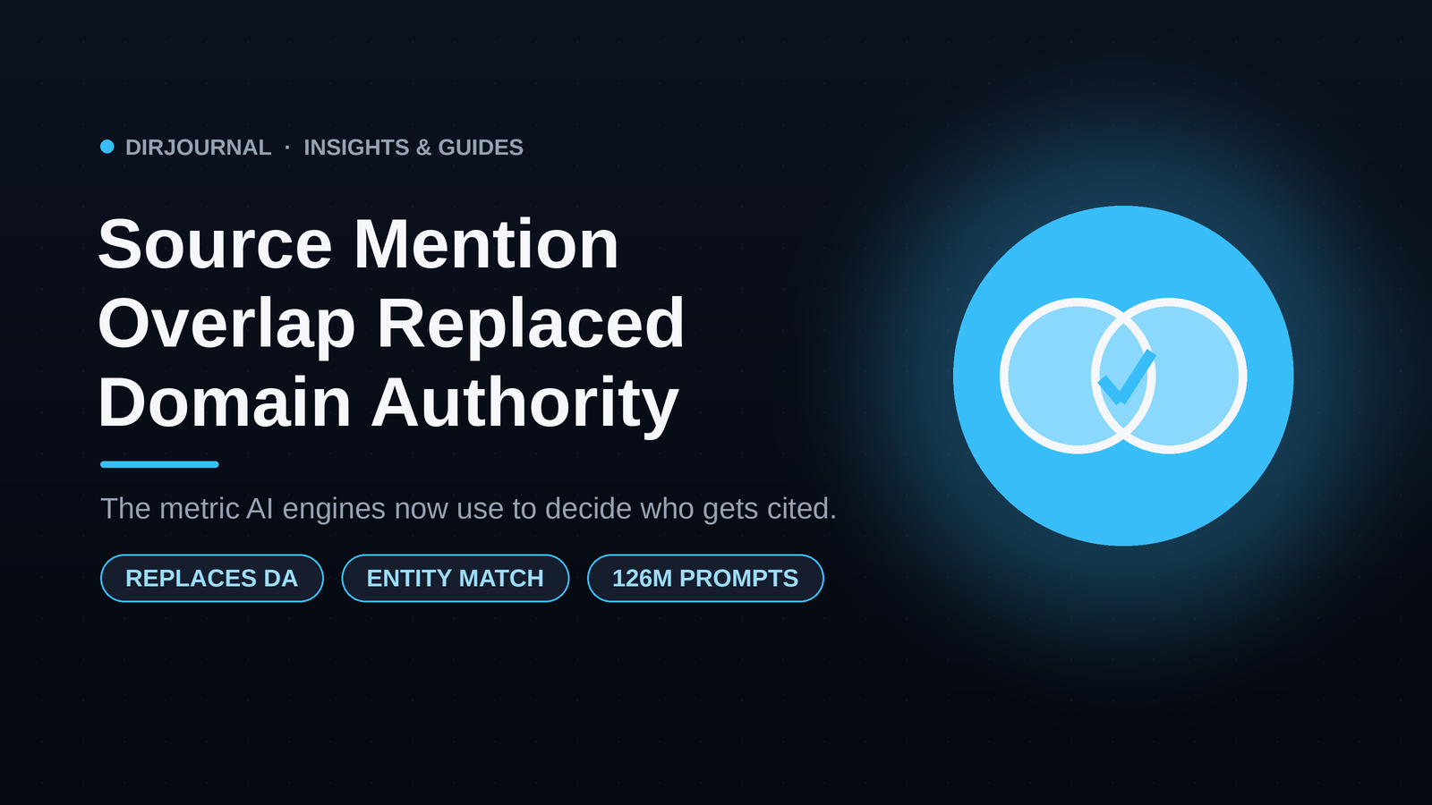
Source Mention Overlap has replaced Domain Authority as the metric AI engines use to decide which businesses to cite. Here is how Entity Corroboration works and why human-curated directories now own the verification loop.
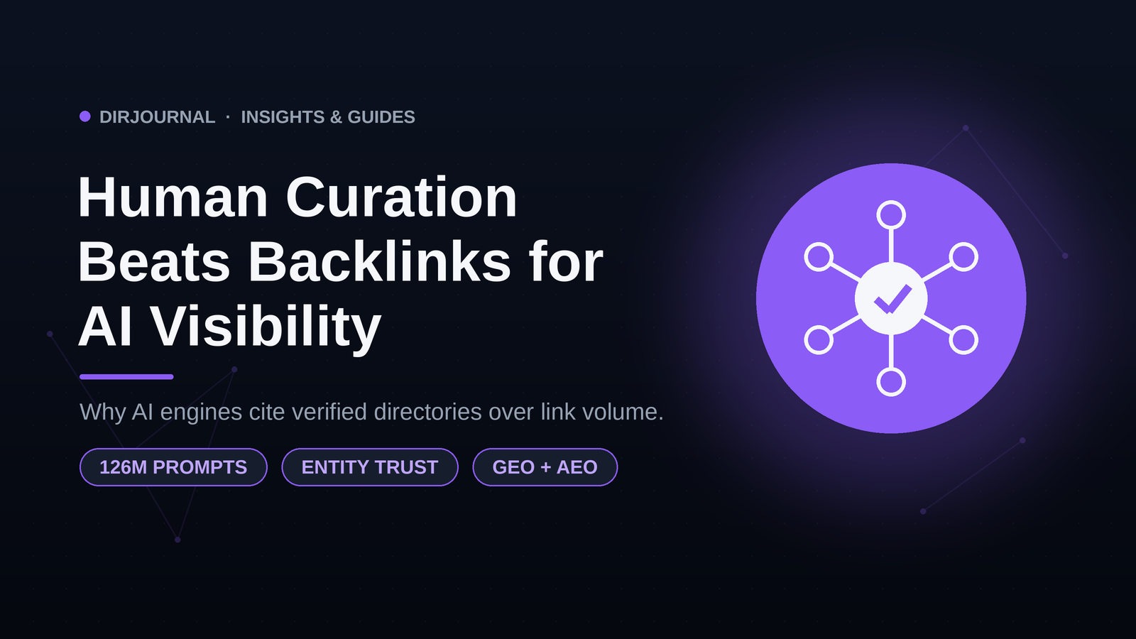
Why AI engines like Google AI Overviews, ChatGPT, and Perplexity prioritize human-curated directories over backlinks — and how to turn that into AI Visibility for your business.