 Editor's Pick
Insights & Guides 5 min read
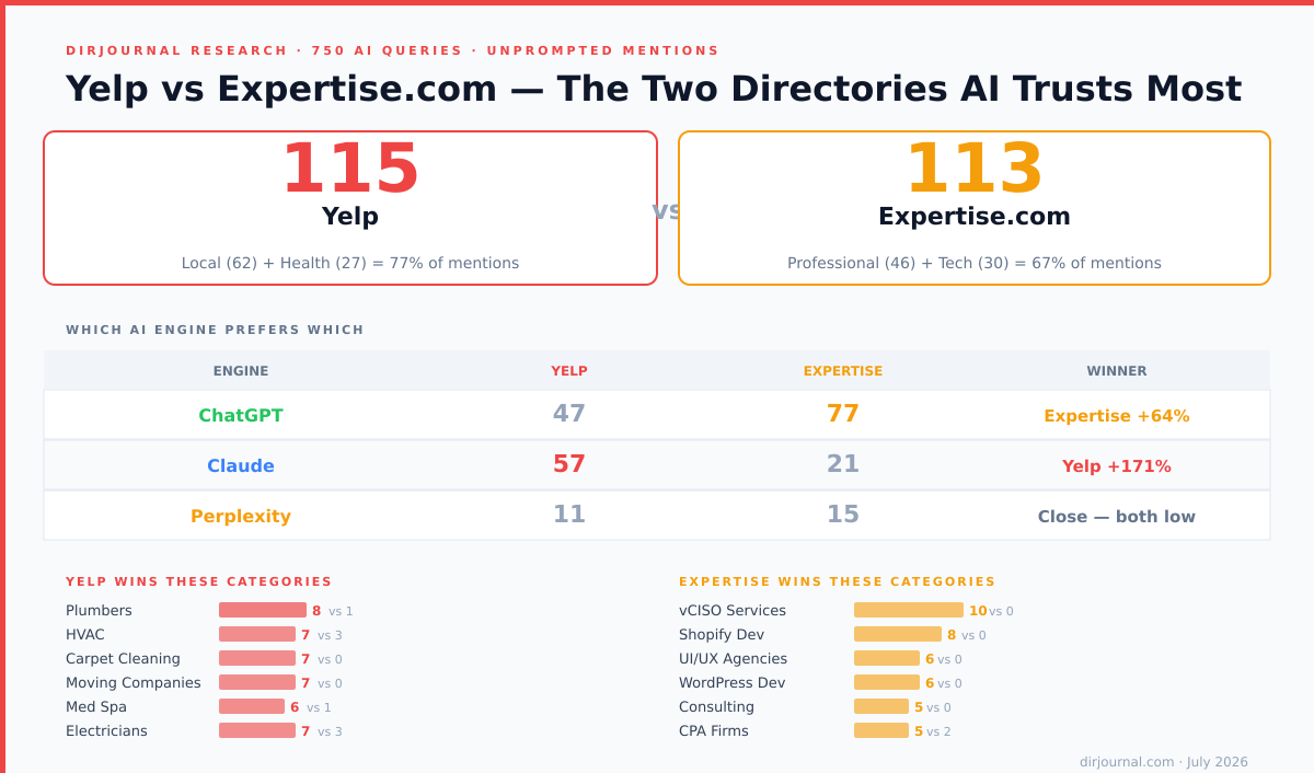
Yelp vs Expertise.com: The Two Directories AI Engines Trust Most
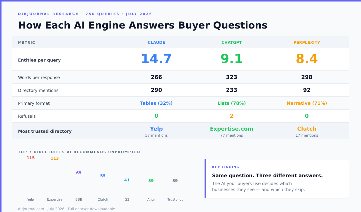
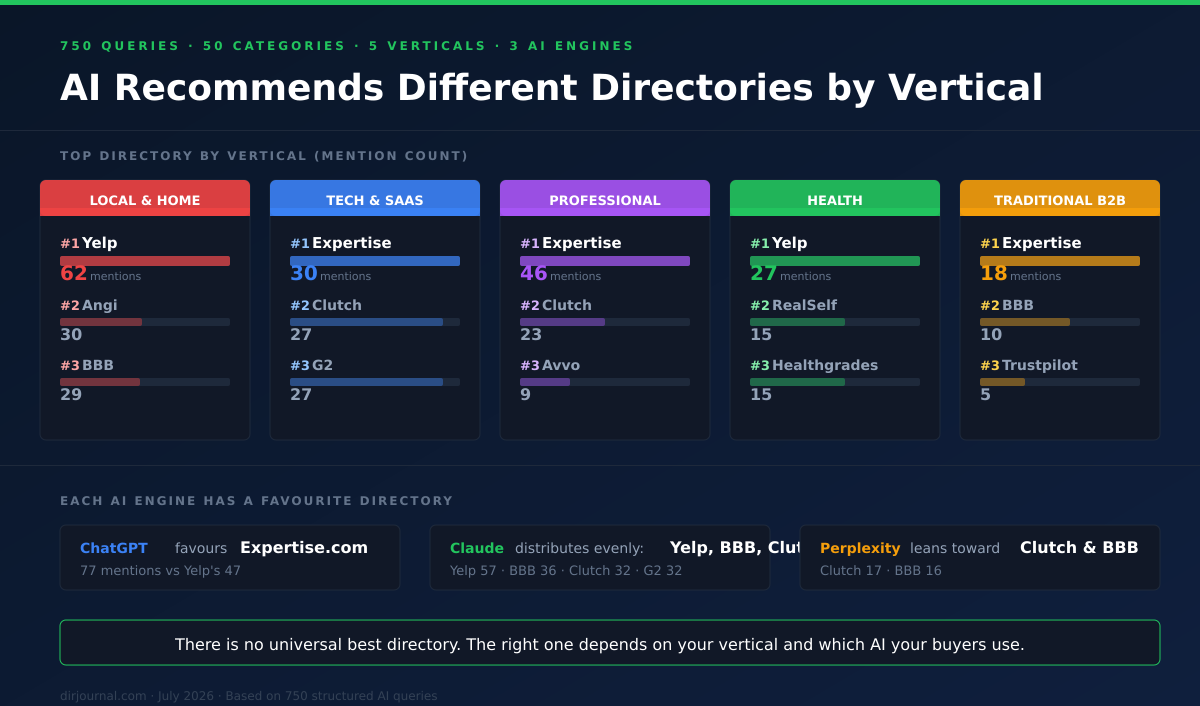
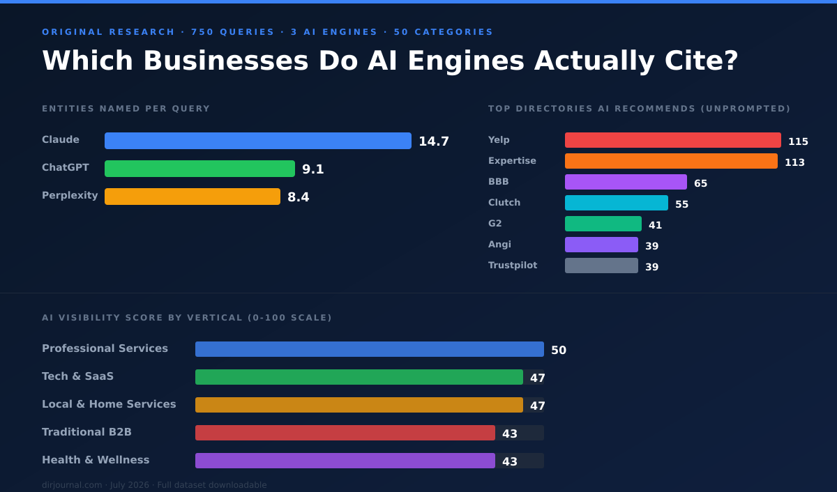
Yelp got 115 AI mentions across 750 queries. Expertise.com got 113. They're nearly tied overall but dominate completely different verticals: Yelp owns local and healthcare, Expertise owns tech and professional services. Which one matters for your business also depends on which AI engine your buyers use — ChatGPT mentions Expertise 77 times, Claude prefers Yelp 57 times.
HS
Hasan Saleem· Jul 27, 2026
Read article