
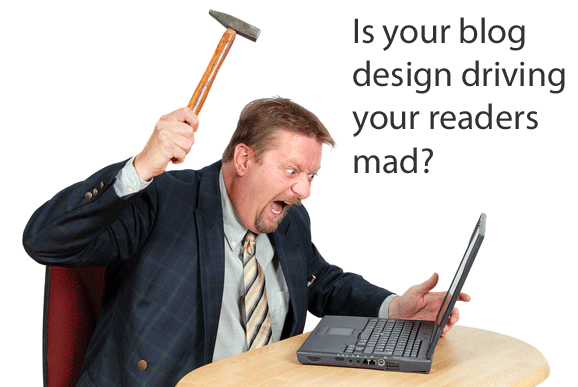
As a blog reader, do you come across some issues in blog design that leave you scratching your head? “Why would they do that?” you might think to yourself. I have those moments too. Now to be fair, I’m far from a fantastic designer, so it’s not my place to be overly critical of someone else’s blog design. But if they want to keep me as a reader, there are some mistakes they simply can’t make.
Here are my top ten pet peeves in blog design and usability:
- No contact information or author details — If I’m reading a blog, I want to know that there is an actual person behind it. Tell me who you are. Post some information about yourself once in a while. But most importantly, have contact details on the blog! Let your readers know someone’s really behind it all, and it’s not just another splog littering the Web. If you’re not comfortable posting an email address, use a contact form. Your address is hidden so it can’t be harvested, but your readers can still reach you.
- No dates on posts — Okay. This really drives me up a wall. It can actually be pretty infuriating as a reader to arrive at a post and find no date on it. Is this new information? Is it outdated and irrelevant now? Um, I don’t know, because you couldn’t be bothered to include a date! This is how bad information gets spread on the Web (just think about all of the outdated SEO “advice” floating around on blogs — would you want to follow advice that’s five years old?). Please. Post a date. We shouldn’t have to dive into previous comments just to get a rough idea of when you posted an article.

- Poor content formatting — This is another rare one, but an issue that really makes me want to leave a blog and never come back. The paragraphs all run together (like with line breaks between them instead of paragraph breaks, so there’s no space between each paragraph). When this happens it’s generally an issue with the theme. Here’s a tip. If this sounds like your blog, fix it! Either fix it yourself, get a coder to go in and adjust the stylesheet, or use another theme. You’ll annoy your readers a lot less that way.
- Too many ads — I run blogs as a part of my business model, so I do understand the desire to monetize them. I also have my limits as a reader. If you have two huge ads before the content starts, you just lost me. If you have a lot of text link ads throughout your content, you probably lost me there too. Strike a balance.
- Irrelevant ads — This can be worse than having too many ads. If I visit your small business site, I really don’t want to see ads for adult dating sites. I really don’t want to see it. If you can’t find something relevant to advertise, then you’re probably in the wrong niche if you want to make money blogging.
- Lack of transparency — The FTC might have weighed in about disclosing blog sponsorships and affiliate relationships, but your readers who are what really matter. And guess what — we’ve wanted transparency and disclosure all along! If you’re going to post an affiliate link, disclose that fact. If you’re posting about a client or sponsor, tell your readers that. We deserve the full truth so we can decide how much we trust the opinions shared in that post. You’re much better off telling readers about the relationship up front than having them make purchases based on your post’s information only to find out later that you might have only said those glowing things because you were profiting from them. Readers appreciate honesty. And just for the record, being up front and honest can lead to more affiliate sales rather than fewer sales. It might not seem like a usability issue on the surface, but it is. Transparency (or a lack thereof) influences how your readers behave in relation to your content.

- Blogs trying to be everything to everyone — From the usability perspective, some bloggers simply try to do too much. That makes navigation more complicated for readers. For example if you want to offer business advice, share entertainment gossip, and post book reviews of novels, they probably don’t all belong on the same blog. It makes readers interested in one topic area frustrated when they have to put up with content in other unrelated topic areas just to find the “good stuff.” Use different domains. If you don’t want completely different blogs, you can keep the same theme, but install it separately on different subdomains of the same main domain — treating it more like a blog network than a single blog trying to offer too much.
- Link preview pop-ups — This is a pet peeve of mine, but I do know some readers like it. Basically, when you mouseover a link, a preview of the site it points to pops up. In theory it’s not a bad idea — I get to see where you’re sending me before I click and leave your site. No surprises. However, I like to mouseover to view the URL in the status bar, and sometimes my mouse pointer just happens to fall over a link when I’m scrolling. In those cases, the pop-up is unwelcome. It takes over my browser, blocking portions of the content I’m trying to read. In my opinion, being able to view the target URL in the status bar is perfectly adequate. After all, it’s not like you get a great view of the site in the previews anyway.


Those are some of my biggest pet peeves when it comes to blog design and usability from the reader perspective. What are some of yours? What features or design faux pas make you want to leave a blog? On the other hand, are there design features you really love that keep you coming back? Leave a comment and share your thoughts.