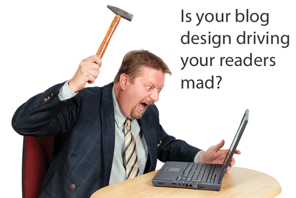
As a blog reader, do you come across some issues in blog design that leave you scratching your head? “Why would they do that?” you might think to yourself. I have those moments too. Now to be fair, I’m far from a fantastic designer, so it’s not my place to be overly critical of someone else’s blog design. But if they want to keep me as a reader, there are some mistakes they simply can’t make.
Here are my top ten pet peeves in blog design and usability:
- No contact information or author details — If I’m reading a blog, I want to know that there is an actual person behind it. Tell me who you are. Post some information about yourself once in a while. But most importantly, have contact details on the blog! Let your readers know someone’s really behind it all, and it’s not just another splog littering the Web. If you’re not comfortable posting an email address, use a contact form. Your address is hidden so it can’t be harvested, but your readers can still reach you.
- No dates on posts — Okay. This really drives me up a wall. It can actually be pretty infuriating as a reader to arrive at a post and find no date on it. Is this new information? Is it outdated and irrelevant now? Um, I don’t know, because you couldn’t be bothered to include a date! This is how bad information gets spread on the Web (just think about all of the outdated SEO “advice” floating around on blogs — would you want to follow advice that’s five years old?). Please. Post a date. We shouldn’t have to dive into previous comments just to get a rough idea of when you posted an article.
 Where’s the subscription option? — Every now and then I can’t figure out how to subscribe to a blog I like. While rare, some bloggers leave the RSS button off completely. More frequently though, the problem is that the blogger thinks they’re being cute design-wise with a super-duper creative RSS button. I don’t want cutesy. I want to know where to friggin’ subscribe to your blog! It’s fine if you want to get creative. But keep some familiar element to your subscription button so people recognize it for what it is.
- Poor content formatting — This is another rare one, but an issue that really makes me want to leave a blog and never come back. The paragraphs all run together (like with line breaks between them instead of paragraph breaks, so there’s no space between each paragraph). When this happens it’s generally an issue with the theme. Here’s a tip. If this sounds like your blog, fix it! Either fix it yourself, get a coder to go in and adjust the stylesheet, or use another theme. You’ll annoy your readers a lot less that way.
- Too many ads — I run blogs as a part of my business model, so I do understand the desire to monetize them. I also have my limits as a reader. If you have two huge ads before the content starts, you just lost me. If you have a lot of text link ads throughout your content, you probably lost me there too. Strike a balance.
- Irrelevant ads — This can be worse than having too many ads. If I visit your small business site, I really don’t want to see ads for adult dating sites. I really don’t want to see it. If you can’t find something relevant to advertise, then you’re probably in the wrong niche if you want to make money blogging.
- Lack of transparency — The FTC might have weighed in about disclosing blog sponsorships and affiliate relationships, but your readers who are what really matter. And guess what — we’ve wanted transparency and disclosure all along! If you’re going to post an affiliate link, disclose that fact. If you’re posting about a client or sponsor, tell your readers that. We deserve the full truth so we can decide how much we trust the opinions shared in that post. You’re much better off telling readers about the relationship up front than having them make purchases based on your post’s information only to find out later that you might have only said those glowing things because you were profiting from them. Readers appreciate honesty. And just for the record, being up front and honest can lead to more affiliate sales rather than fewer sales. It might not seem like a usability issue on the surface, but it is. Transparency (or a lack thereof) influences how your readers behave in relation to your content.
 Registration required in order to comment — This is another huge pet peeve of mine, and I have a strict policy — I will not comment on a blog that forces me to sign up or register on the site. There are no ifs, ands, or buts about it. If you force registration on me, I’ll rebel. Worse, I’ll probably leave my comments on my own blog, pointing out the obnoxious behavior of your own (not to mention that I’ll probably turn to a competing blog instead of yours in the future).
- Blogs trying to be everything to everyone — From the usability perspective, some bloggers simply try to do too much. That makes navigation more complicated for readers. For example if you want to offer business advice, share entertainment gossip, and post book reviews of novels, they probably don’t all belong on the same blog. It makes readers interested in one topic area frustrated when they have to put up with content in other unrelated topic areas just to find the “good stuff.” Use different domains. If you don’t want completely different blogs, you can keep the same theme, but install it separately on different subdomains of the same main domain — treating it more like a blog network than a single blog trying to offer too much.
- Link preview pop-ups — This is a pet peeve of mine, but I do know some readers like it. Basically, when you mouseover a link, a preview of the site it points to pops up. In theory it’s not a bad idea — I get to see where you’re sending me before I click and leave your site. No surprises. However, I like to mouseover to view the URL in the status bar, and sometimes my mouse pointer just happens to fall over a link when I’m scrolling. In those cases, the pop-up is unwelcome. It takes over my browser, blocking portions of the content I’m trying to read. In my opinion, being able to view the target URL in the status bar is perfectly adequate. After all, it’s not like you get a great view of the site in the previews anyway.
Those are some of my biggest pet peeves when it comes to blog design and usability from the reader perspective. What are some of yours? What features or design faux pas make you want to leave a blog? On the other hand, are there design features you really love that keep you coming back? Leave a comment and share your thoughts.


My pet peeve is blogs that don't take the time to select featured posts. When I come to a blog I don't want to make my decision to subscribe based solely on the article I'm reading, nor the one you wrote 5 minutes ago. I want to check out a small collection of what you consider your best work.
If I like it, you've got a subscriber.
If you don't have your best stuff on display, or you only offer RSS snippets, your blog is stuck in 2001 and useless to me.
Thanks for the heads up, very good article, will retweet that
Having to register to comment always makes me wonder. Do these bloggers just not want people to comment or what?
I agree with all of these, and in addition, I would add blogs that have no simple description that you can view from any page, ie., in the sidebar, or at least a main category listing so I can figure that the blog is about social media if it includes Twitter, Facebook, and LinkedIn.
I should do this on my site. I have the related posts at the end of each article, and the main categories listed in the menu bar, but you're right – there should be some favorite posts listed in the sidebar. I'll add that to my site's to do list!
Very helpful article. I will repost and tweet this, and go through the list item by item and conduct an inventory of my blog.
I agree with you on all of the points except the one about being forced to login to post a comment. I think that a lot of people are setting their blogs so that you have to login to comment because they get a TON of spam if they don't. People, or bots, or whatever just come to your blog and post links and nonsense everywhere! It's quite horrible. Logging in can be time consuming but if you are really interested in the blog it can be worth it.
Thanks for your great articles!
I support your peeve about blogs being unfocused. After all, if I'm subscribing, it's because I like your writing and the topics you write about. If I'm interested in vacation tips, I don't really want to be notified about your blog on plant care. The one thing good about having to register to comment is that you can upload your avatar – which is always nice to see who's making a comment.
Totally sympathize with the sentiments of your article.
Point 9 is my particular pet peeve. I favor simplicity and hate blogs which have too much going on. Focus on one action you want your reader to take, don't give them so many options that they're confused over what your blog is about.
Thanks for the article, I've linked to this page for my own readers to learn and comment.
hell no!
it depends…
hell yeeeah!
c’monnnn watermelon!
Hahahahaha! That was hilarious!!!!!!!!!!!!!!!!!!! OMGLOL!
Stop now please.
wow… shorty.
These are all good pet peeves about blogs. Not such a fan of the registering to comment but it is nice that things like Disqus make it easy to sign up once for many blogs.
This is fantastic stuff. I agree to most of them except to subscribe to comment. It is good to leave it open without subscribing but I got few spams from it. The best option is to install Captcha code before submission of the comments. I had it install last week and thankfully, I receive less spams comment. If you are using WordPress, then, you can get this Captcha code plugin free in your Plugin area.
I agree with every one of your peeves, and would add one more — blogs that have difficult or no navigation. If I commented on a blog two days ago and want to go back and read the blogger's reply (if any), I need to be able to get to that post, and sometimes I can't. I've also been guilty of some of these myself, but live and learn. 🙂
I agree with Gerald. I'm never going to register on a blog to post. Don't make me jump through hoops! Make it easy and I'll give you some credit.
Great post too. Thanks Jennifer.
Completely agree with your post – nicely put too!
well, I would move navigation to the top of your list, but that's just a pet peeve of mine. … Awesome post on blog usability
it is so popular site!
keeps getting better and better! I will tell my friends about it.
@gerald – the registering to comment thing always makes me wonder whether they want people to comment or not! Blogs are part of web2, social networking and all that… It should be made easier for people to interact – not put a wall up to stop people commenting!!
Always a terrible idea to require that users are registered before they can add comments
[…] that the Crafterminds and I have observed as being blog mistakes. Here’s a great article on 10 Pet Peeves in Blog Design and Usability, which covers some things that I didn’t. Everyone has their own personal list of blog pet […]
Hello, thanks for outlining those points, especially number 2, relating to the often non-existent date issue. There’re times when it’s important to know whether the ariticle is current. For instance, if it’s a technology related article, you would rather not waste your time reading articles that are a few years old.
Cheers,
Pope
Technology is a great niche example where dates on posts are extremely important. I think dates are also important if you want your blog posts to be more linkable. You’re likely to be excluded for roundup link posts on other niche blogs if people can’t tell that your posts are recent. And those citing posts as sources for their own articles won’t use yours and link to them if they aren’t sure they’re currently relevant.
I’m battling with a recent theme I purchased over this very issue. It was designed to show the month and day, but not the year. For the life of me I can’t figure out why the designer thought that was a good idea. It’s almost more confusing than having no date information at all. Fortunately that blog (still being developed) is related to fiction, so dates are less important for research purposes. But I still hope to find a fix that doesn’t screw up the date area design too badly.
I’ve noticed several “professional” websites lately have no contact or about web page any more. I began to think this was a “new concept”, so thank YOU for making me realize it’s just sloppy website designing that’s going on and nothing more.
What do you term as disclosure of an affiliate link? a recommends web page with an affiliat link on it that redirects once clicked. First time I saw that I immediately thought… wow, how professional! So I imitated it.
Thanks for a great post!
Trish
I can see some kinds of sites not bothering. For example, a brand new blog. But I don’t get the attraction of that. For me to stick around on a blog, I probably want to get to know the blogger a bit. And if I’m going to hire someone, I absolutely expect to find background information and contact details on their website.
As for affiliate link disclosures, you could do a recommendation page if you want. I tend to prefer that over affiliate links littering sidebars. But understand your links will probably get fewer clicks that way because fewer people will see that page. For the disclosures themselves, you just have to make sure the site tells visitors that those links are based on affiliate relationships. Calling them “recommended” isn’t a disclosure on its own. You’re supposed to disclose the fact that you make money when those affiliate links are clicked. Some sites mark each affiliate link individually in some way while others have a sitewide affiliate link policy and just mention at the end of a page that the content may include affiliate links. To the best of my knowledge this is only a requirement if you’re in the U.S. But it’s good practice no matter where you are because it builds more trust with visitors.
I am happy to see this article about your ten peeves in blog design and usability.Its interesting points to learn and i will bookmark this link.I think website design should be optimized to the reader’s perspective.The design features should be unique and simple to focus the reader’s attention.Thanks