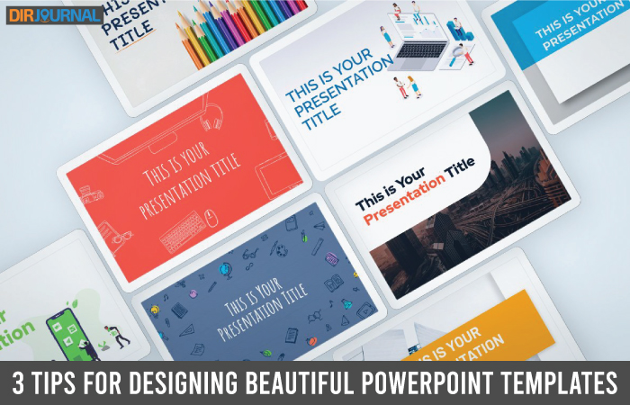
Your main goal when it comes to designing powerpoint templates is to hook your audience. Perhaps the look of your powerpoint template wouldn’t matter if you were an incredible speaker who has the gift of drawing people in with just the sound of your voice, but for many people this is difficult to do and requires a lot of time and practice. This isn’t to say that you don’t need to practice your speech, by all means you should, but a good looking powerpoint template can be enough to distract your audience ever so slightly from your, “Um”s and “Ugh”s so that they are still moved by your overall presentation.
Pay attention to color
When it comes to designing your powerpoint template, your choice of color can make or break your entire presentation. Keep in mind that people will need to look at your slides for a considerable amount of time. The average powerpoint presentation is roughly twenty minutes long, and if your entire outline makes use of bright and vibrant colors, your audience’s eyes will strain and the chances of them paying attention to the content of your presentation will be low.
That being said, it is still important to use contrasting colors that make the text stand out from the background. Using the color wheel below, you can choose colors that fall on opposite ends of the circle to use together.

Typically the rule you should follow is to place dark text on a light background and vice versa.
Furthermore, studies have shown that use of cool colors, such as blue, produce sensations of productivity and calm. Office buildings often make use of the color, and many software companies or online tools use a lot of blue in their branding. The CRM Salesforce, for instance uses a lot of blue on their website, and so does the infographic maker, Venngage.
Blue is calming and healing, and brings about a feeling of peacefulness. Think of the sensation that is brought on by a clear blue sky; you likely feel invigorated but also at ease. The interesting thing about the color blue is that it can evoke both low-arousal emotions as well as high-arousal emotions. When used in small doses along with warm colors (red and yellow) you can attract a person’s attention, but not to the point of frustration since the blue acts as a natural calming element.
Negative space is your friend
Negative space refers to the blank area around a given object. What this does is allow the object of choice to stand out on a page.

As you can see in the example above, the use of negative space allows text and icons to pop on a page. Just because you may have access to a lot of unique icons and colors, doesn’t mean it’s necessary to use them all. Some of the best powerpoint templates are great because there is clear focus on the subject. In order to bring focus to one element, it’s important that there isn’t too much distracting from said subject.
Larger font and less text wins
Have you ever heard the 10/20/30 rule? It’s a rule coined by Guy Kawasaki which states that the ideal powerpoint presentation should only have 10 slides, last 20 minutes and have a minimum of size 30 font. Why size 30 font? Because the larger your font, the less likely your slide will appear to be cluttered with unnecessary text. Too frequently do people include paragraphs of text that they simply go on to reiterate during their presentation. Your audience doesn’t need to read your speech word-for-word. They simply need to juicy nuggets of information that are crucial to understanding the gist of the subject you are teaching.
In addition, using less font and a larger text can make your powerpoint template far more attractive and easy to understand. Much like negative space allows an image or line of text to pop, using fewer words will create more space to frame themselves.
Conclusion
Overall, if you want your powerpoint templates to look good and get your message across, you need to ensure that you are appealing to your audience’s tastes. Use colors that will keep them focused and engaged, and frame text and images by ensuring there is negative space around them. Finally, only include the main takeaway points in your presentation and try to keep the font at least a size 30.


