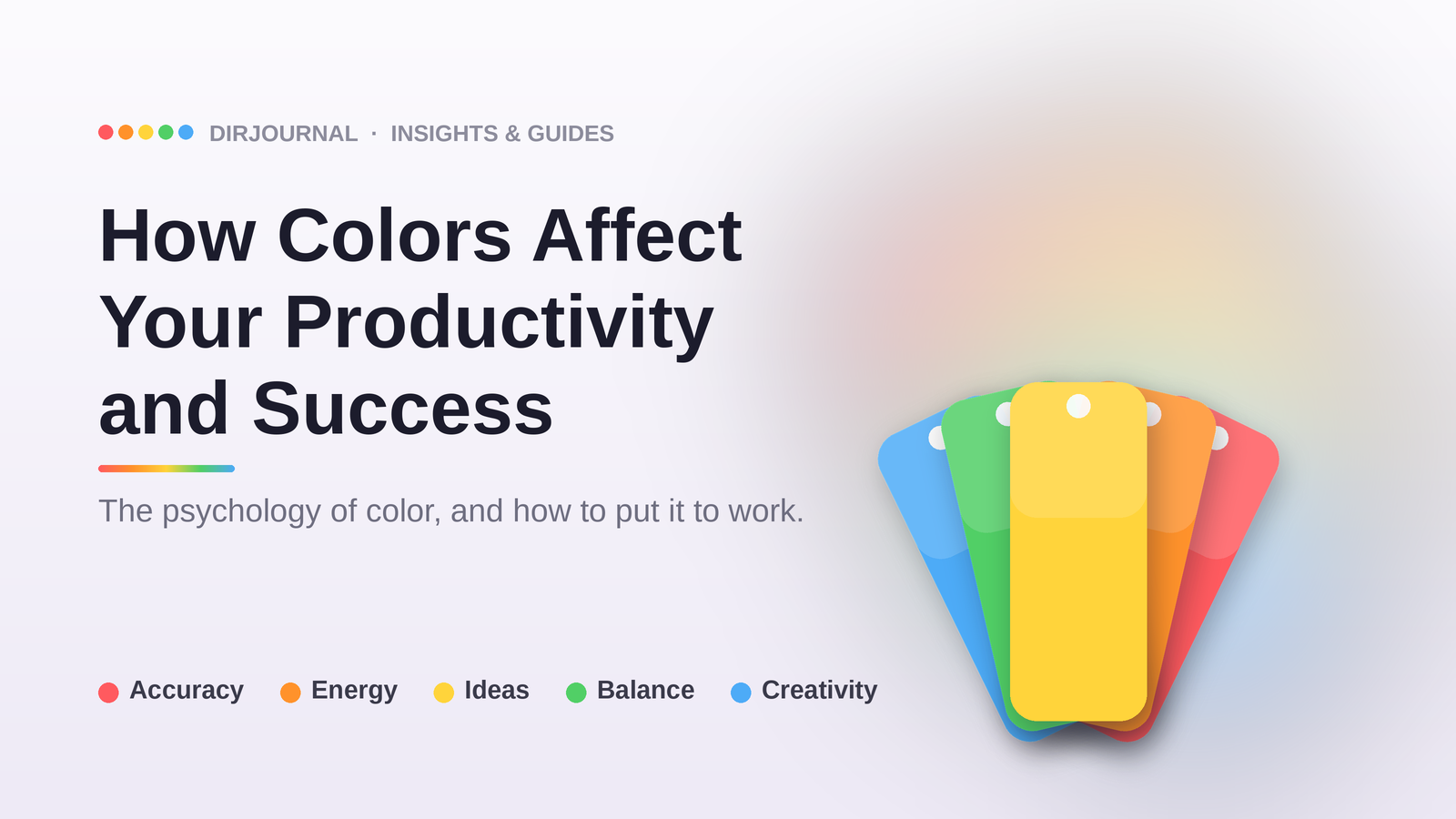
Green: the Balanced Performer
Green may be the single most versatile color for productivity. Sitting at the center of the visible spectrum, it requires zero adjustment from the eye, making it the most restful color to look at. This is one reason why so many hospitals, schools, and offices historically used green tones.
Research from the University of Essex found that exercising in a green environment — or even viewing green images — improved mood and self-esteem more than any other color. In workspace design, green has been shown to improve reading ability and comprehension. The rise of biophilic design — incorporating plants, living walls, and natural green tones — is partly rooted in these findings. Companies like Amazon (with its Spheres in Seattle) and Apple Park (with its massive interior garden) have invested millions in green workspace design.
Orange: Physical Energy Without Aggression
Orange combines the energy of red with the optimism of yellow, creating a warm, stimulating environment without the intensity that can make red feel aggressive. It is particularly effective in spaces designed for physical activity, socializing, or active collaboration.
Fitness brands like Nike use orange prominently. In workspace design, orange is best used in breakout spaces, meeting rooms for energetic brainstorming, or communal kitchens — anywhere you want people to feel energized and sociable. It is not recommended for focused, individual deep work.
Practical Applications for 2026
Color psychology has evolved significantly since the days of simply painting your office walls. In 2026, here are the most impactful ways to use color for productivity:
Home office: Blue or green as your primary environment (walls, desk mat, monitor background), with yellow or orange accents for creative energy. Avoid red as a dominant color — save it for small elements where you need detail focus, like a red pen for proofreading.
Digital workspace: Your screen is your environment for 8+ hours a day. Dark mode reduces blue light exposure in the evening, which helps sleep — and sleep is the single biggest driver of next-day productivity. During the day, a blue-toned light theme can maintain alertness.
Meeting rooms: Match the color to the meeting type. Blue and white for strategic planning sessions (calm, big-picture thinking). Orange or yellow accents for brainstorming (energy, creativity). Green for conflict resolution or sensitive conversations (calming, balanced).
The biophilic factor: Perhaps the most significant development in workspace color science is the recognition that natural, living green outperforms painted or artificial green significantly. A 2022 meta-analysis of 42 studies confirmed that real plants in the workplace reduce stress by up to 37% and increase productivity by roughly 15%. The color matters, but the context matters more — and nothing beats the real thing.
Yellow: the Creative Catalyst
Yellow is the color most strongly associated with mental activity and creative energy. It stimulates the nervous system in a way distinct from red — where red triggers fight-or-flight alertness, yellow activates the brain's innovative and lateral-thinking pathways. Brands like IKEA, McDonald's, and Snapchat deploy yellow to create feelings of optimism, warmth, and accessibility.
In a workspace context, yellow accents — not walls — work best. A fully yellow room can cause anxiety and eye fatigue over extended periods. But yellow desk accessories, sticky notes, or a single accent wall in a brainstorming room has been shown to boost ideation output. The key is moderation: yellow as a highlight, not a flood.
Green: the Balanced Performer
Green may be the single most versatile color for productivity. Sitting at the center of the visible spectrum, it requires zero adjustment from the eye, making it the most restful color to look at. This is one reason why so many hospitals, schools, and offices historically used green tones.
Research from the University of Essex found that exercising in a green environment — or even viewing green images — improved mood and self-esteem more than any other color. In workspace design, green has been shown to improve reading ability and comprehension. The rise of biophilic design — incorporating plants, living walls, and natural green tones — is partly rooted in these findings. Companies like Amazon (with its Spheres in Seattle) and Apple Park (with its massive interior garden) have invested millions in green workspace design.
Orange: Physical Energy Without Aggression
Orange combines the energy of red with the optimism of yellow, creating a warm, stimulating environment without the intensity that can make red feel aggressive. It is particularly effective in spaces designed for physical activity, socializing, or active collaboration.
Fitness brands like Nike use orange prominently. In workspace design, orange is best used in breakout spaces, meeting rooms for energetic brainstorming, or communal kitchens — anywhere you want people to feel energized and sociable. It is not recommended for focused, individual deep work.
Practical Applications for 2026
Color psychology has evolved significantly since the days of simply painting your office walls. Here are the most impactful ways to use color for productivity in your daily work:
Home office: Blue or green as your primary environment (walls, desk mat, monitor background), with yellow or orange accents for creative energy. Avoid red as a dominant color — save it for small elements where you need detail focus, like a red pen for proofreading.
Digital workspace: Your screen is your environment for 8+ hours a day. Dark mode reduces blue light exposure in the evening, which helps sleep — and sleep is the single biggest driver of next-day productivity. During the day, a blue-toned light theme can maintain alertness.
Meeting rooms: Match the color to the meeting type. Blue and white for strategic planning sessions (calm, big-picture thinking). Orange or yellow accents for brainstorming (energy, creativity). Green for conflict resolution or sensitive conversations (calming, balanced).
The biophilic factor: Perhaps the most significant development in workspace color science is the recognition that natural, living green outperforms painted or artificial green significantly. A 2022 meta-analysis of 42 studies confirmed that real plants in the workplace reduce stress by up to 37% and increase productivity by roughly 15%. The color matters, but the context matters more — and nothing beats the real thing.